Roles Visualization
Published:
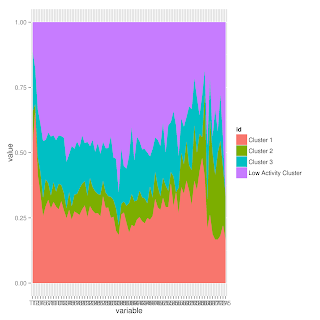
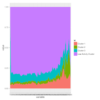
And this is what the code produces (some new colors would probably be a good thing to work on next!)
library(reshape2)
library(ggplot2)


#clusters.mlt <- melt(clusters, id.vars="id")
#clusters.agg <- aggregate(. ~ id + variable, clusters.mlt, sum)

# The minimum number of times a user has to be in a given group in order to
# be shown in the graph for that group
minMonths = 2

makeGraph <- function(clusters){
        clus1 <- apply(clusters, 2, function(x) {sum(x=='1', na.rm=TRUE)})
        clus2 <- apply(clusters, 2, function(x) {sum(x=='2', na.rm=TRUE)})
        clus3 <- apply(clusters, 2, function(x) {sum(x=='3', na.rm=TRUE)})
        clus0 <- apply(clusters, 2, function(x) {sum(x=='0', na.rm=TRUE)})
        clusters2 <- data.frame(clus0, clus1, clus2, clus3)
        c2 <- t(clusters2)
        c3 <- as.data.frame(c2)
        c3$id = c('Low Activity Cluster', 'Cluster 1', 'Cluster 2', 'Cluster 3')
        c3 <- c3[order(c3$'id'),]
        return(ggplot(melt(c3, id.vars="id")) +
          geom_area(aes(x=variable, y=value, fill=id, group=id), position="fill"))
}
#print(ggplot(clusters.mlt) +
 # stat_summary(aes(x=variable, y=value, fill=id, group=id), fun.y=sum, position="fill",        geom="area"))

# Stats for just those who were in each group

clusterDF <- as.data.frame(read.csv('clustersByID.csv'))
ggsave(file="../Results/allUsers.png", plot=makeGraph(clusterDF))
cl1 <- clusterDF[apply(clusterDF, 1, function(x) {sum(x[2:76] == "1", na.rm=TRUE) >=            minMonths}),]
ggsave("../Results/Role1_2+.png", makeGraph(cl1))


 There are some interesting things going on here, but no clear movement into the central-type role (Role 1).